Introduction
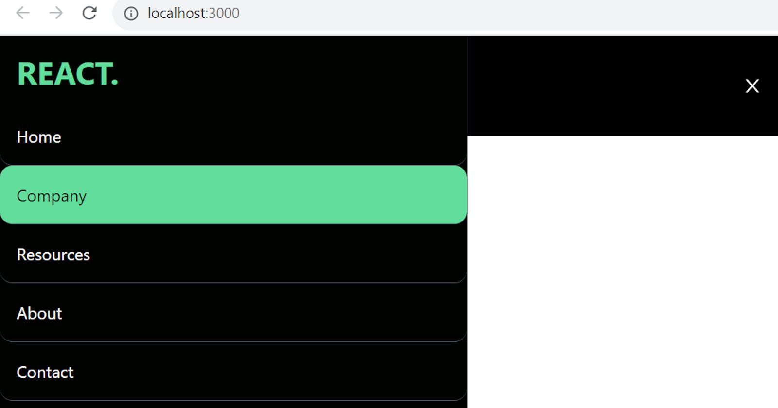
In the dynamic realm of web development, creating an elegant and responsive navigation bar is a fundamental aspect of designing user-friendly interfaces. In this tutorial, we'll dive into the process of constructing a sleek and adaptable navbar using the powerful combination of Tailwind CSS and React Icons. This navbar will not only enhance the visual appeal of your application but will also seamlessly adjust to various screen sizes, providing an optimal user experience.
Getting Started
Before we embark on our navbar creation journey, let's ensure that our project is equipped with the necessary tools. Install Tailwind CSS and React Icons using the following commands:
# Install Tailwind CSS
npm install tailwindcss

# Install React Icons
npm install react-icons
Building the Navbar Component
Now, let's delve into the core of our tutorial—the Navbar component.
Navbar Component (Navbar.jsx)
import React, { useState } from 'react';
import { AiOutlineClose, AiOutlineMenu } from 'react-icons/ai';

const Navbar = () => {
  // State to manage the navbar's visibility
  const [nav, setNav] = useState(false);

  // Toggle function to handle the navbar's display
  const handleNav = () => {
    setNav(!nav);
  };

  // Array containing navigation items
  const navItems = [
    { id: 1, text: 'Home' },
    { id: 2, text: 'Company' },
    { id: 3, text: 'Resources' },
    { id: 4, text: 'About' },
    { id: 5, text: 'Contact' },
  ];

  return (
    <div className='bg-black flex justify-between items-center h-24 max-w-[1240px] mx-auto px-4 text-white'>
      {/* Logo */}
      <h1 className='w-full text-3xl font-bold text-[#00df9a]'>REACT.</h1>

      {/* Desktop Navigation */}
      <ul className='hidden md:flex'>
        {navItems.map(item => (
          <li
            key={item.id}
            className='p-4 hover:bg-[#00df9a] rounded-xl m-2 cursor-pointer duration-300 hover:text-black'
          >
            {item.text}
          </li>
        ))}
      </ul>

      {/* Mobile Navigation Icon */}
      <div onClick={handleNav} className='block md:hidden'>
        {nav ? <AiOutlineClose size={20} /> : <AiOutlineMenu size={20} />}
      </div>

      {/* Mobile Navigation Menu */}
      <ul
        className={
          nav
            ? 'fixed md:hidden left-0 top-0 w-[60%] h-full border-r border-r-gray-900 bg-[#000300] ease-in-out duration-500'
            : 'ease-in-out w-[60%] duration-500 fixed top-0 bottom-0 left-[-100%]'
        }
      >
        {/* Mobile Logo */}
        <h1 className='w-full text-3xl font-bold text-[#00df9a] m-4'>REACT.</h1>

        {/* Mobile Navigation Items */}
        {navItems.map(item => (
          <li
            key={item.id}
            className='p-4 border-b rounded-xl hover:bg-[#00df9a] duration-300 hover:text-black cursor-pointer border-gray-600'
          >
            {item.text}
          </li>
        ))}
      </ul>
    </div>
  );
};

export default Navbar;
Integrating the Navbar into Your App
With our Navbar component ready, let's seamlessly integrate it into our main App component.
App Component (app.js)
import React from 'react';
import Navbar from './components/Navbar';

function App() {
  return (
    <div>
      <Navbar />
    </div>
  );
}

export default App;
Conclusion
You've just crafted a visually appealing and responsive navbar for your React application. By leveraging the capabilities of Tailwind CSS and React Icons, you've ensured that your navigation bar not only looks great on various devices but also provides a seamless user experience. Feel free to customize the styles and expand the functionality to suit the unique needs of your project. Happy coding!
