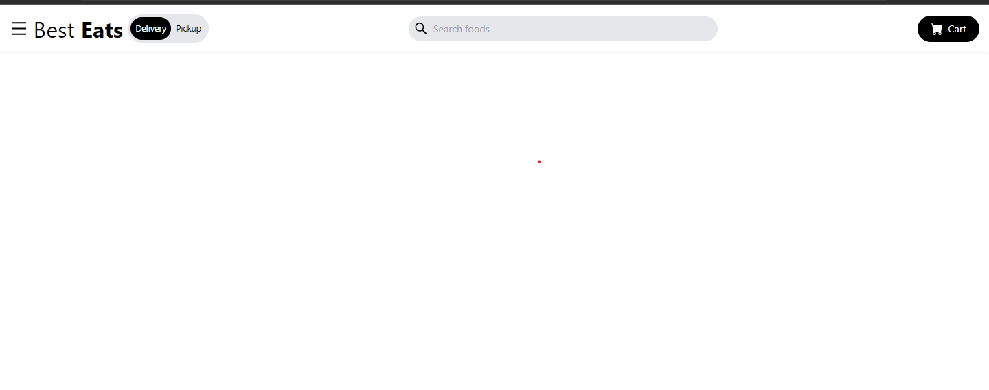
In this article, we’ll walk through the creation of a responsive navigation bar (navbar) component in React. The navbar will feature a mobile-friendly menu, search functionality, and cart button. We’ll also explore how to use icons from popular icon libraries like React Icons.
Prerequisites
Before you begin, ensure that you have the following tools and libraries installed:
Node.js (with npm)
Project Setup
First, make sure you have a React project set up. You can create one using Create React App.
Creating the Navbar Component
Create a new file called Navbar.js in your src/components directory and add the following code:
import React, { useState } from "react";
import { AiOutlineMenu, AiOutlineSearch, AiOutlineClose } from "react-icons/ai";
import { BsFillCartFill } from "react-icons/bs";
import { TbTruckDelivery } from "react-icons/tb";
import { FaWallet } from "react-icons/fa";
import { MdFavorite, MdHelp } from "react-icons/md";

const Navbar = () => {
  const [nav, setNav] = useState(false);

  const menuItems = [
    { icon: <TbTruckDelivery size={25} className="mr-4" />, text: "Orders" },
    { icon: <MdFavorite size={25} className="mr-4" />, text: "Favorites" },
    { icon: <FaWallet size={25} className="mr-4" />, text: "Wallet" },
    { icon: <MdHelp size={25} className="mr-4" />, text: "Help" },
  ];

  return (
    <div className="max-w-[1640px] mx-auto flex justify-between items-center p-4 shadow-sm">
      {/* Left side */}
      <div className="flex items-center">
        <div onClick={() => setNav(!nav)} className="cursor-pointer">
          <AiOutlineMenu size={30} />
        </div>
        <h1 className="text-2xl sm:text-3xl lg:text-4xl px-2">
          Best <span className="font-bold">Eats</span>
        </h1>
        <div className="hidden lg:flex items-center bg-gray-200 rounded-full p-1 text-[14px]">
          <p className="bg-black text-white rounded-full p-2">Delivery</p>
          <p className="p-2">Pickup</p>
        </div>
      </div>

      {/* Search Input */}
      <div className="bg-gray-200 rounded-full flex items-center px-2 w-[200px] sm:w-[400px] lg:w-[500px]">
        <AiOutlineSearch size={25} />
        <input
          className="bg-transparent p-2 w-full focus:outline-none"
          type="text"
          placeholder="Search foods"
        />
      </div>
      {/* Cart button */}
      <button className="bg-black text-white hidden md:flex items-center py-2 rounded-full border border-black px-5 ">
        <BsFillCartFill size={20} className="mr-2" /> Cart
      </button>

      {/* Mobile Menu */}
      {/* Overlay */}
      {nav ? (
        <div className="bg-black/80 fixed w-full h-screen z-10 top-0 left-0"></div>
      ) : (
        ""
      )}

      {/* Side drawer menu */}
      <div
        className={
          nav
            ? "fixed top-0 left-0 w-[300px] h-screen bg-white z-10 duration-300"
            : "fixed top-0 left-[-100%] w-[300px] h-screen bg-white z-10 duration-300"
        }
      >
        <AiOutlineClose
          onClick={() => setNav(!nav)}
          size={30}
          className="absolute right-4 top-4 cursor-pointer"
        />
        <h2 className="text-2xl p-4">
          Best <span className="font-bold">Eats</span>
        </h2>
        <nav>
          <ul className="flex flex-col p-4 text-gray-800">
            {menuItems.map(({ icon, text }, index) => {
              return (
                <div key={index} className=" py-4">
                  <li className="text-xl flex cursor-pointer  w-[50%] rounded-full mx-auto p-2 hover:text-white hover:bg-black">
                    {icon} {text}
                  </li>
                </div>
              );
            })}
          </ul>
        </nav>
      </div>
    </div>
  );
};

export default Navbar;
Using the Navbar Component
In your src directory, create an App.js file with the following code to use the Navbar component:
import React from "react";
import Navbar from "./components/Navbar";
function App() {
  return (
    <div>
      <Navbar />
    </div>
  );
}
export default App;
Styling
Make sure to add appropriate CSS or use a CSS-in-JS solution like Tailwind CSS to style your components as shown in the code.
Conclusion
In this tutorial, we’ve built a responsive navbar component in React using icons from the React Icons library. This navbar features a mobile-friendly menu, search input, and cart button. You can further customize and enhance this navbar to suit your project’s needs.
