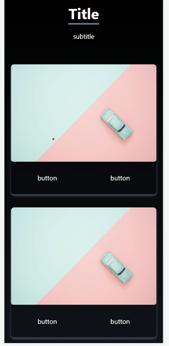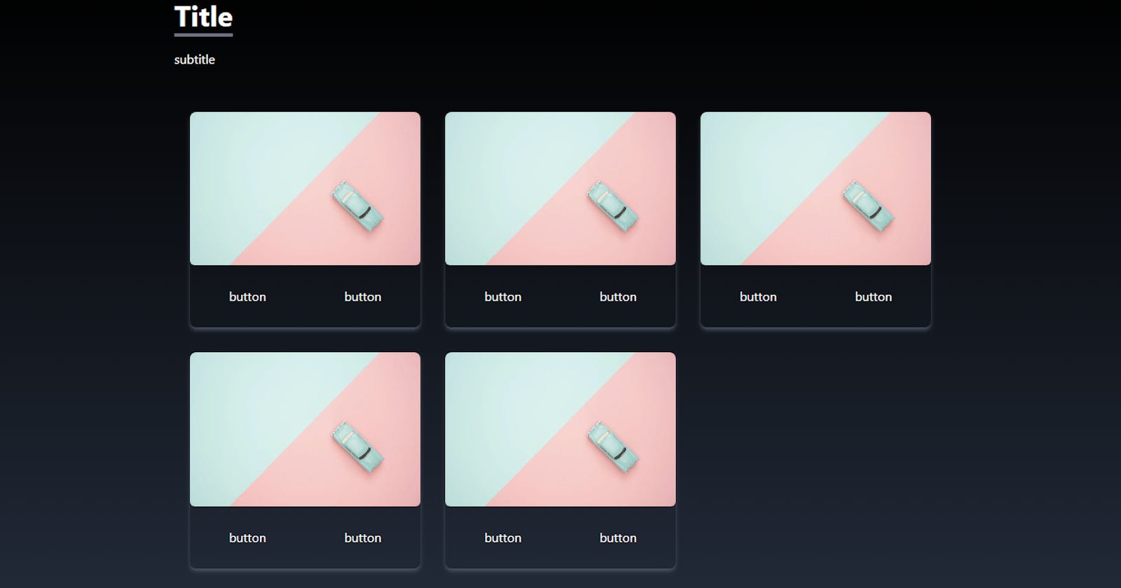
In this tutorial, we’ll learn how to create a captivating image grid using React and Tailwind CSS. Image grids are a popular way to display visual content in an appealing and interactive manner. We’ll walk through the process of setting up the project, structuring the code, and applying styling to achieve a professional-looking image grid that includes clickable buttons for each image.
Prerequisites
Basic understanding of React and JavaScript
Node.js and npm installed on your machine
Getting Started
To begin, make sure you have a React project set up. If you don’t have one already, you can create a new project using create-react-app:
npx create-react-app image-grid-app
cd image-grid-app
Next, navigate to the src directory and create a new component named ImageGrid.js. This is where we'll implement our image grid.
Implementing the Image Grid
In the ImageGrid.js file, replace the existing code with the following:
import React from 'react';

export function ImageGrid() {
   const items = [
    {
      id: 1,
      src: 'https://images.pexels.com/photos/1037995/pexels-photo-1037995.jpeg?auto=compress&cs=tinysrgb&w=1260&h=750&dpr=1',
      link: 'link here',
    },
    {
      id: 2,
      src: 'https://images.pexels.com/photos/1037995/pexels-photo-1037995.jpeg?auto=compress&cs=tinysrgb&w=1260&h=750&dpr=1',
      link: 'link here',
    },
    {
      id: 3,
      src: 'https://images.pexels.com/photos/1037995/pexels-photo-1037995.jpeg?auto=compress&cs=tinysrgb&w=1260&h=750&dpr=1',
      link: 'link here',
    },
    {
      id: 4,
      src: 'https://images.pexels.com/photos/1037995/pexels-photo-1037995.jpeg?auto=compress&cs=tinysrgb&w=1260&h=750&dpr=1',
      link: 'link here',
    },
    {
      id: 5,
      src: 'https://images.pexels.com/photos/1037995/pexels-photo-1037995.jpeg?auto=compress&cs=tinysrgb&w=1260&h=750&dpr=1',
      link: 'link here',
    },
  ];
  return (
    <>
      <div
        name=''
        className='bg-gradient-to-b from-black to-gray-800 w-full text-white md:h-screen text-center md:text-left'
      >
        <div className='max-w-screen-lg p-4 mx-auto flex flex-col justify-center w-full h-full'>
          <div className='pb-8'>
            <p className='text-4xl font-bold inline border-b-4 border-gray-500'>
Title            </p>
            <p className='py-6'>subtitle</p>
          </div>

          <div className='grid sm:grid-cols-2 md:grid-cols-3 gap-8 sm:px-5'>
            {items.map(({ id, src, link }) => (
              <div
                key={id}
                className='shadow-md shadow-gray-600 rounded-lg overflow-hidden'
              >
                <img
                  src={src}
                  alt=''
                  className='rounded-md duration-200 hover:scale-105'
                />
                <div className='flex items-center justify-center'>
                  <button
                    className='w-1/2 px-6 py-3 m-4 duration-200 hover:scale-105'
                    onClick={() => window.open(link, '_blank')}
                  >
                    button
                  </button>
                  <button
                    className='w-1/2 px-6 py-3 m-4 duration-200 hover:scale-105'
                    onClick={() => window.open(link, '_blank')}
                  >
                    button
                  </button>
                </div>
              </div>
            ))}
          </div>
        </div>
      </div>
    </>
  );
}
In this code, we define an array of items, each containing an id, an src URL for the image, and a link URL for the associated link. The component uses the map function to render each item in the array as a visually appealing card in the image grid. Each card includes the image, and two clickable buttons that open the provided links in new tabs.
Styling with Tailwind CSS
This project utilizes the power of Tailwind CSS for styling. The classes used in the JSX elements define various aspects of the design, such as colors, spacing, and animation effects.
Conclusion
In this tutorial, we’ve created a dynamic and engaging image grid using React and Tailwind CSS. You can further customize this grid by adjusting the styling, adding more items, or integrating it into a larger application. Image grids are a versatile way to showcase visual content, and by understanding the concepts demonstrated here, you can take your React projects to the next level.
