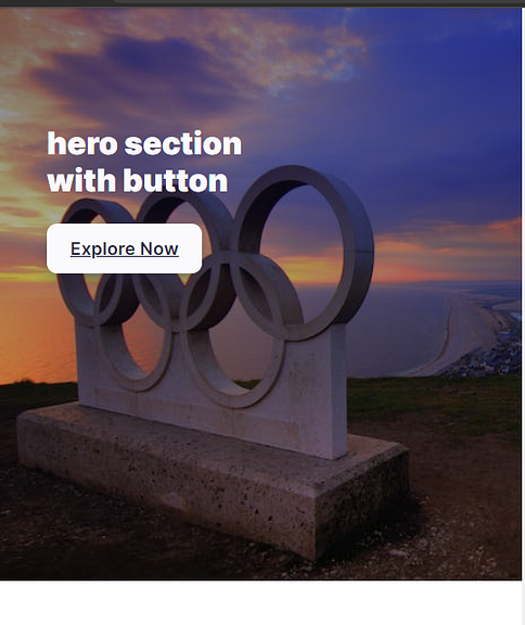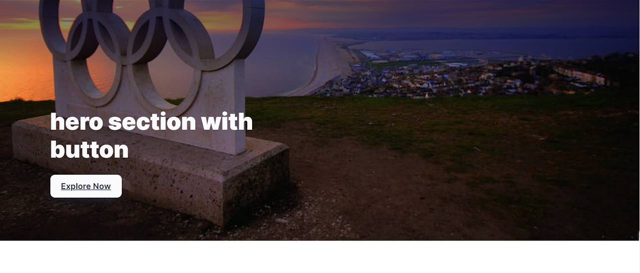

In the world of web development, crafting visually appealing and user-friendly interfaces is paramount. One of the key elements that can significantly enhance the aesthetics and user engagement of a website is the hero section. The hero section is usually the first thing users see when they land on a website and plays a crucial role in setting the tone and conveying the main message. In this article, we'll walk you through the process of creating a stunning hero section in a React application using Styled Components.
Getting Started
To create an impressive hero section, we'll start by building the necessary components and styles. Here's a breakdown of the files we'll be working with:
Header.js: This file contains the definition of the
Headercomponent that will house our hero section.global.css: This file contains global styles that will be applied throughout the application.
App.js: This file is the entry point of our application and will render the
Headercomponent.
The Header Component (Header.js)
In the Header component, we define the structure of our hero section. It consists of a background image, a title, and a call-to-action button. We use Styled Components to apply dynamic styling based on the device's screen width. Let's break down the code:
"use client"; // for nextjs 13.4
import React from "react";
import styled from "styled-components";

const Header = () => {
  return (
    <div>
      <HeroSection className="light hero">
        <div className="heroInner">
          <span>
            <h1>hero section with button</h1>
            <a href="#" className="btn btn-light">
              Explore Now
            </a>
          </span>
        </div>
      </HeroSection>
    </div>
  );
};

export default Header;

const HeroSection = styled.section`
  background: linear-gradient(to bottom, #0a0c2c80 3rem, transparent 10rem),
    url(https://images.pexels.com/photos/133325/pexels-photo-133325.jpeg?auto=compress&cs=tinysrgb&w=1260&h=600&dpr=1);
  background-position: center, bottom left;
  background-size: cover, cover;
  height: fit-content;
  color: #fafafc;
  padding: 15rem 3rem 6rem;
  .heroInner {
    display: flex;
    max-width: 1200px;
    margin: 0 auto;
  }
  span {
    max-width: 50%;
  }
  h1 {
    font-weight: 900;
    font-size: clamp(2rem, 5.5vw, 3.25rem);
    line-height: 1.2;
    margin-bottom: 1.5rem;
  }
  @media (max-width: 576px) {
    background: linear-gradient(to bottom, #0a0c2c80 3rem, transparent),
      url(https://images.pexels.com/photos/133325/pexels-photo-133325.jpeg?auto=compress&cs=tinysrgb&w=800&h=750&dpr=1);
    background-position: center, bottom left;
    background-size: cover, cover;
    align-items: flex-start;
    padding-top: 7.5rem;
    height: 75vh;
    max-height: 720px;
  }
`;
In the code above, we define the structure of the hero section using JSX. The HeroSection component uses styled-components to apply dynamic styles, including background images and responsive adjustments.
Global Styles (global.css)
Next, let's take a look at the global styles defined in the global.css file. These styles will be applied globally to elements throughout the application:
*,
*::before,
*::after {
  padding: 0;
  margin: 0;
  box-sizing: border-box;
}

html {
  overflow-y: scroll;
}

body {
  font-family: "Nunito Sans", sans-serif;
  line-height: 1.5;
  -webkit-tap-highlight-color: transparent;
  font-size: 1rem;
}

button {
  font-family: inherit;
  color: inherit;
  text-decoration: inherit;
}

.btn {
  display: inline-block;
  white-space: nowrap;
  padding: 0.75rem 1.5rem;
  font-size: 1.15rem;
  font-weight: 600;
  color: #2e2e48;
  background: #fafafc;
  border-radius: 0.66rem;
  transition: all 0.2s;
  box-shadow: 0 0.5rem 1.5rem -0.5rem currentColor;
}

.btn:hover,
.btn:focus {
  box-shadow: 0 0 0 2px #2e2e48, 0 0 0 4px #fafafc;
}

.btn:active {
  transform: scale(0.95);
}
Rendering the Hero Section (App.js)
Finally, let's integrate the Header component into our application by rendering it within the App.js file:
import React from "react";
import Header from "@/Components/Header";

export default function App() {
  return (
    <div>
      <Header />
    </div>
  );
}
The Header component is imported and rendered within the Home functional component. This will display the stunning hero section at the top of the application.
Conclusion
In this tutorial, we've explored the process of creating an eye-catching hero section using React and Styled Components. By combining dynamic styling and responsive design techniques, we've crafted a visually appealing introduction to your website. With the global.css file, we've ensured consistent styling across the application.
Feel free to customize the styles, images, and content to match your project's requirements. By understanding the principles outlined in this article, you're well-equipped to build captivating hero sections that leave a lasting impression on your website visitors.
