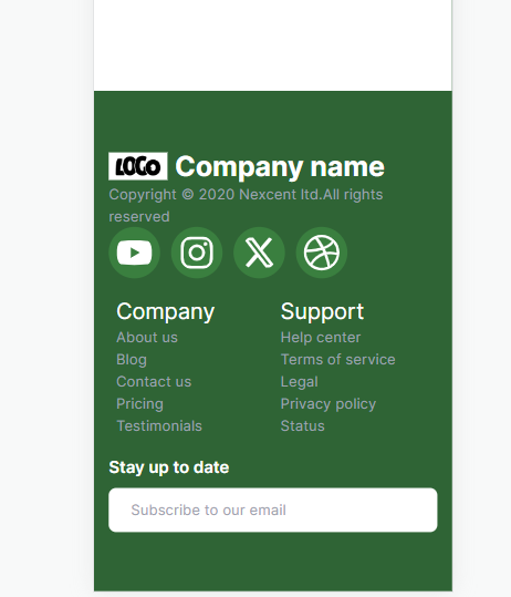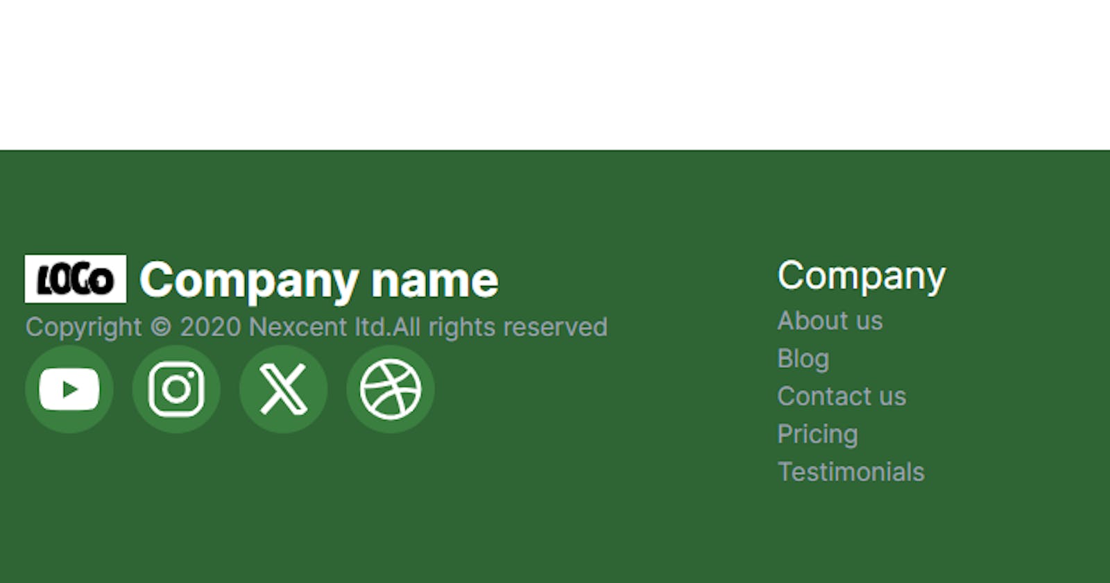

In web development, creating an appealing and functional footer is crucial for a polished user experience. In this article, we’ll explore how to build a sleek footer component using Tailwind CSS and React Icons. We’ll break down the code step by step and explain the key components involved.
Prerequisites
Before diving into the code, make sure you have the following set up:
React project
Tailwind CSS integration
react-icons library for icon integration
Getting Started
Let’s start by creating a functional React component for our footer. Here’s the code:
import {
  FaInstagram,
  FaDribbble,
  FaXTwitter,
  FaYoutube,
} from "react-icons/fa6";

const Footer = () => {
  const socialLinks = [
    { label: "YouTube", icon: FaYoutube },
    { label: "Instagram", icon: FaInstagram },
    { label: "Twitter", icon: FaXTwitter },
    { label: "Dribbble", icon: FaDribbble },
  ];

  const links = [
    [
      { label: "Company", key: "header-1" },
      { label: "About us", key: "item-1-1" },
      { label: "Blog", key: "item-1-2" },
      { label: "Contact us", key: "item-1-3" },
      { label: "Pricing", key: "item-1-4" },
      { label: "Testimonials", key: "item-1-5" },
    ],
    [
      { label: "Support", key: "header-2" },
      { label: "Help center", key: "item-2-1" },
      { label: "Terms of service", key: "item-2-2" },
      { label: "Legal", key: "item-2-3" },
      { label: "Privacy policy", key: "item-2-4" },
      { label: "Status", key: "item-2-5" },
    ],
  ];

  return (
    <div className="app min-h-screen flex items-end justify-center font-poppins">
      <div className="py-16 grid lg:grid-cols-3 md:grid-cols-2 sm:grid-cols-2 grid-cols-1 bg-green-800 text-white w-full p-4 relative">
        <div className="  ">
          <div className="footer-img flex items-center">
            <img
              src={"https://i.imgur.com/520zDfd.png"}
              alt=""
              className="w-16 h-auto"
            />
            <span className="text-3xl font-bold pl-2 text-white">
              Company name
            </span>
          </div>
          <div className="infos text-gray-400">
            <span>Copyright © 2020 Nexcent ltd.</span>
            <span>All rights reserved</span>
          </div>
          <div className="footer-icons flex items-center space-x-3">
            {socialLinks.map((socialLink, index) => {
              const Icon = socialLink.icon;
              return (
                <Icon
                  key={`social-${index}`}
                  className="w-14 h-14 p-2 rounded-full bg-green-700 hover:bg-white hover:text-green-700 cursor-pointer"
                />
              );
            })}
          </div>
        </div>
        <div className="mx-2 grid w-full py-5 sm:py-0 grid-cols-2 ">
          {links.map((col, index) => {
            return (
              <ul className={`col col-${index + 1}`} key={`col-${index}`}>
                {col.map((link, index) => {
                  return (
                    <li
                      key={`link-${col}-${index}`}
                      className={`text-gray-400 cursor-pointer ${
                        link.key === "header-1" || link.key === "header-2"
                          ? "text-2xl text-white"
                          : ""
                      }`}
                    >
                      {link.label}
                    </li>
                  );
                })}
              </ul>
            );
          })}
        </div>
        <div className="footer-form flex flex-col  ">
          <label className="text-lg font-semibold text-white">
            Stay up to date
          </label>
          <input
            type="email"
            placeholder="Subscribe to our email"
            className="mt-2 w-full border-none rounded-lg py-3 px-6"
          />
        </div>
      </div>
    </div>
  );
};

export default Footer;
Now import Footer component to App.js file
import Footer from "@/Components/Footer";

const page = () => {
  return (
    <>
      <Footer />
      {/* other component here */}
    </>
  );
};

export default page;
Explanation
Let’s break down the key components of our footer component:
Social Media Icons: We import social media icons from
react-icons/fa6and render them as clickable icons.Footer Links: We organize the footer links into two columns, each containing links with labels like “About us,” “Blog,” and more. These links are mapped and displayed dynamically.
Company Info: We display the company logo, name, and copyright information.
Email Subscription: An input field for users to subscribe to the newsletter.
Styling with Tailwind CSS
Tailwind CSS classes are used extensively to style the footer. Classes like text-white, bg-green-800, rounded-full, and others are applied to various elements for a clean and responsive design.
Conclusion
In this article, we’ve created a stylish and functional footer component for your React application using Tailwind CSS and React Icons. You can customize this footer to fit the branding and content of your website. A well-designed footer can improve user engagement and navigation on your site. Happy coding!
