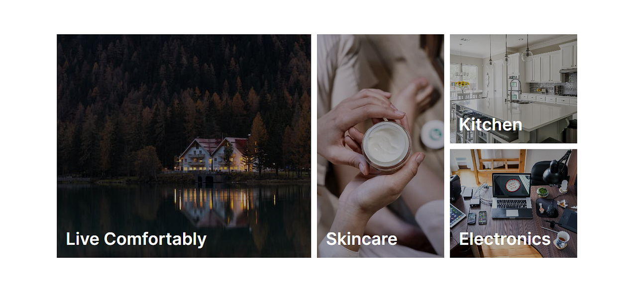
In the world of web development, user interfaces are key to capturing users’ attention and providing them with an enjoyable experience. One way to achieve this is by creating visually appealing grids that showcase various categories or products. In this tutorial, we’ll walk you through how to create an elegant category grid using React and CSS Grid.
Introduction
In this tutorial, we’ll be building a category grid component using React and styling it with CSS Grid. The grid will display different categories with images and descriptions, providing an engaging interface for users to explore.
Getting Started
Before we dive into the code, make sure you have Node.js and npm installed on your machine. If not, you can download and install them from the official Node.js website.
Let’s start by setting up our React application and creating the necessary components.
- Project Setup: Create a new React application using
create-react-app.
npx create-react-app category-grid-app cd category-grid-app
- Component Setup: Replace the contents of
src/App.jswith the following code.
import React from "react";
import "./globals.css";

const categories = [
  {
    to: "categories/furnitures",
    imgSrc:
      "https://images.pexels.com/photos/1612351/pexels-photo-1612351.jpeg?auto=compress&cs=tinysrgb&w=600",
    alt: "img1",
    description: "Live Comfortably",
    className: "grid-one",
  },
  {
    to: "categories/skin-care",
    imgSrc:
      "https://images.pexels.com/photos/4046316/pexels-photo-4046316.jpeg?auto=compress&cs=tinysrgb&w=600",
    alt: "img2",
    description: "Skincare",
    className: "grid-two",
  },
  {
    to: "categories/kitchen",
    imgSrc:
      "https://images.pexels.com/photos/1080721/pexels-photo-1080721.jpeg?auto=compress&cs=tinysrgb&w=1260&h=750&dpr=1",
    alt: "img3",
    description: "Kitchen",
    className: "grid-four",
  },
  {
    to: "categories/electronics",
    imgSrc:
      "https://images.pexels.com/photos/356056/pexels-photo-356056.jpeg?auto=compress&cs=tinysrgb&w=1260&h=750&dpr=1",
    alt: "img4",
    description: "Electronics",
    className: "grid-four-low",
  },
];

export default function App() {
  return (
    <div className="home-container">
      <div className="container">
        <div className="grid-container">
          {categories.map((category, index) => (
            <div key={index} className={`featured ${category.className}`}>
              <a Href={category.to}>
                <div id={`img${index + 1}`} className="lil-overlay"></div>
                <img src={category.imgSrc} alt={category.alt} />
                <p className="main-description">{category.description}</p>
              </a>
            </div>
          ))}
        </div>
      </div>
    </div>
  );
}
- Styling: Create a new file named
style.cssin thesrcfolder
@import url('https://fonts.googleapis.com/css2?family=Blinker:wght@200;400;600;700&display=swap');

* {
  margin: 0;
  padding: 0;
  box-sizing: border-box;
  scroll-behavior: smooth;
}

body {
  font-family: 'Blinker', sans-serif;
  position: relative;
}

html {
  font-size: 62.5%;
}

/* global */
.container {
  max-width: 1200px;
  margin: 0 auto;
  padding: 0 19px;
}
.grid-container {
  display: grid;
  height: 50rem;
  grid-template-columns: 2fr 1fr 1fr;
  grid-template-rows: 1fr 1fr;
  grid-template-areas: 'one two four' 'one two four-low';
  gap: 1.3rem;
  margin-top: 1.3rem;
}

.home-container {
  padding-top: 12rem;
}

.featured {
  overflow: hidden;
  position: relative;
  cursor: pointer;
}

.main-description {
  position: absolute;
  bottom: 2rem;
  left: 2rem;
  color: white;
  font-size: 3.8rem;
  font-weight: 600;
}

.featured img {
  height: 100%;
  width: 100%;
  object-fit: cover;
  object-position: 50% 50%;
}

.grid-one {
  grid-area: one;
}

.grid-two {
  grid-area: two;
}

.grid-four {
  grid-area: four;
}

.grid-four-low {
  grid-area: four-low;
}

.lil-overlay {
  position: absolute;
  width: 100%;
  height: 100%;
  top: 0;
  left: 0;
  background-color: rgba(0, 0, 0, 0.3);
  transition: all 0.3s ease-in;
}


#img1:hover {
  background-color: rgba(0, 0, 0, 0.5) !important;
}

#img2:hover {
  background-color: rgba(0, 0, 0, 0.5) !important;
}

#img3:hover {
  background-color: rgba(0, 0, 0, 0.5) !important;
}

#img4:hover {
  background-color: rgba(0, 0, 0, 0.5) !important;
}

@media (max-width:750px) {
  .grid-container {
      height: 500px;
      display: grid;
      grid-template-columns: repeat(2, 1fr);
      grid-template-rows: repeat(2, 1fr);
      grid-template-areas:
          "one two"
          "four four-low";
      grid-gap: 13px;
      gap: 13px;
  }
}

@media (max-width:450px) {
  .main-description {
      bottom: 1rem;
      left: 1rem;
      font-size: 3rem;
  }
}

@media (max-width:400px) {
  .main-description {
      bottom: 1rem;
      left: 0.5rem;
      font-size: 2.5rem;
  }
}
Creating the Category Grid
Our React component renders a grid of categories using the data from the categories array. Each category is displayed with an image, description, and overlay effect. Let's break down the key components of this code:
We have an array called
categoriesthat contains objects representing each category. Each object includes properties liketo(URL),imgSrc(image URL),alt(image alt text),description(category description), andclassName(CSS class name).Inside the
Appcomponent, we map through thecategoriesarray to generate the grid items. TheclassNamefrom each category is used to position items within the grid.The overlay effect is achieved using the
.lil-overlayCSS class, which provides a semi-transparent background on hover.Media queries are used to make the grid responsive. As the screen width decreases, the grid adapts to ensure a smooth experience on various devices.
Conclusion
In this tutorial, we learned how to create a st
