Building a Product Card Grid with React, Tailwind CSS, and React Icons (E-commerce website)


In today’s digital age, creating visually appealing and interactive product grids is a crucial aspect of web development, especially for e-commerce websites. In this tutorial, we will explore how to build a product grid using React, Tailwind CSS, and React Icons.
Prerequisites
Before we dive into the code, make sure you have the following prerequisites installed:
Node.js and npm (Node Package Manager)
Create React App (CRA) or your preferred React setup
Setting Up Your Project
To get started, create a new React application and install the necessary packages:
npx create-react-app product-grid-app
cd product-grid-app
npm install tailwindcss react-icons
Now, let’s integrate Tailwind CSS into your project. Open the src/index.css file and add the following:
/* src/index.css */
@import "tailwindcss/base";
@import "tailwindcss/components";
@import "tailwindcss/utilities";
Next, create a Tailwind CSS configuration file:
npx tailwindcss init -p
In your tailwind.config.js file, enable JIT mode for faster development:
// tailwind.config.js
/** @type {import('tailwindcss').Config} */
module.exports = {
  content: [
    "./src/**/*.{js,jsx,ts,tsx}",
  ],
  theme: {
    extend: {},
  },
  plugins: [],
}
Now that your project is set up, let’s create the components for your product grid.
Creating the Product Component
Inside the src/components/home/Products directory, create a new file named Product.js and add the following code:
// src/components/home/Products/Product.js
import React from "react";
import { BsSuitHeartFill } from "react-icons/bs";
import { GiReturnArrow } from "react-icons/gi";
import { FaShoppingCart } from "react-icons/fa";
import { MdOutlineLabelImportant } from "react-icons/md";

const Product = (props) => {
  return (
    <div className="w-full relative group">
      <div className="max-w-80 max-h-80 relative overflow-y-hidden ">
        <div>
          <img className="w-full h-full" src={props.img} />
        </div>
        <div className="w-full h-32 absolute bg-white -bottom-[130px] group-hover:bottom-0 duration-700">
          <ul className="w-full h-full flex flex-col items-end justify-center gap-2 font-titleFont px-2 border-l border-r">
            <li className="text-[#767676] hover:text-primeColor text-sm font-normal border-b-[1px] border-b-gray-200 hover:border-b-primeColor flex items-center justify-end gap-2 hover:cursor-pointer pb-1 duration-300 w-full">
              Compare
              <span>
                <GiReturnArrow />
              </span>
            </li>
            <li className="text-[#767676] hover:text-primeColor text-sm font-normal border-b-[1px] border-b-gray-200 hover:border-b-primeColor flex items-center justify-end gap-2 hover:cursor-pointer pb-1 duration-300 w-full">
              Add to Cart
              <span>
                <FaShoppingCart />
              </span>
            </li>
            <li className="text-[#767676] hover:text-primeColor text-sm font-normal border-b-[1px] border-b-gray-200 hover:border-b-primeColor flex items-center justify-end gap-2 hover:cursor-pointer pb-1 duration-300 w-full">
              View Details
              <span className="text-lg">
                <MdOutlineLabelImportant />
              </span>
            </li>
            <li className="text-[#767676] hover:text-primeColor text-sm font-normal border-b-[1px] border-b-gray-200 hover:border-b-primeColor flex items-center justify-end gap-2 hover:cursor-pointer pb-1 duration-300 w-full">
              Add to Wish List
              <span>
                <BsSuitHeartFill />
              </span>
            </li>
          </ul>
        </div>
      </div>
      <div className="max-w-80 py-6 flex flex-col gap-1 border-[1px] border-t-0 px-4">
        <div className="flex items-center justify-between font-titleFont">
          <h2 className="text-lg text-primeColor font-bold">
            {props.productName}
          </h2>
          <p className="text-[#767676] text-[14px]">${props.price}</p>
        </div>
        <div>
          <p className="text-[#767676] text-[14px]">{props.color}</p>
        </div>
      </div>
    </div>
  );
};

export default Product;
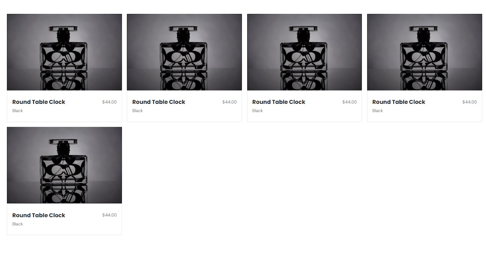
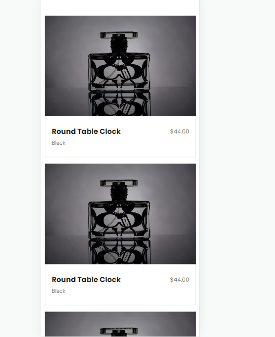
This Product component represents an individual product card with product image, actions, and details.
Creating the Home Component
Now, let’s create the Home component that will display a grid of products. In your src directory, create a file named Home.js and add the following code:
import React from "react";
import Product from "../../components/home/Products/Product";

const products = [
  {
    _id: "100001",
    img: "https://images.pexels.com/photos/258244/pexels-photo-258244.jpeg?auto=compress&cs=tinysrgb&w=1260&h=750&dpr=1",
    productName: "Round Table Clock",
    price: "44.00",
    color: "Black",
  },
  {
    _id: "100002",
    img: "https://images.pexels.com/photos/258244/pexels-photo-258244.jpeg?auto=compress&cs=tinysrgb&w=1260&h=750&dpr=1",
    productName: "Round Table Clock",
    price: "44.00",
    color: "Black",
  },
  {
    _id: "100003",
    img: "https://images.pexels.com/photos/258244/pexels-photo-258244.jpeg?auto=compress&cs=tinysrgb&w=1260&h=750&dpr=1",
    productName: "Round Table Clock",
    price: "44.00",
    color: "Black",
  },
  {
    _id: "100004",
    img: "https://images.pexels.com/photos/258244/pexels-photo-258244.jpeg?auto=compress&cs=tinysrgb&w=1260&h=750&dpr=1",
    productName: "Round Table Clock",
    price: "44.00",
    color: "Black",
  },
  {
    _id: "100005",
    img: "https://images.pexels.com/photos/258244/pexels-photo-258244.jpeg?auto=compress&cs=tinysrgb&w=1260&h=750&dpr=1",
    productName: "Round Table Clock",
    price: "44.00",
    color: "Black",
  },
];

const App = () => {
  return (
    <div className="container mx-auto my-96">
      <div className="grid md:grid-cols-2 sm:grid-cols-1 lg:grid-cols-4 gap-4">
        {products.map((product, index) => (
          <Product
            key={index}
            _id={product._id}
            img={product.img}
            productName={product.productName}
            price={product.price}
            color={product.color}
          />
        ))}
      </div>
    </div>
  );
};

export default App;
The Home component renders a grid of products by mapping over the products array and passing the product data as props to the Product component.
Conclusion
With this setup, you can easily create a visually appealing product grid in your React application using Tailwind CSS for styling and React Icons for adding interactive icons. Feel free to expand upon this code by adding more products and customizing the styles to match your project’s requirements. Happy coding!