

In the world of e-commerce, a well-designed product detail page can make all the difference. It's where potential customers gather the information they need to make a purchase decision. In this article, we'll explore how to create an engaging product detail page using React, along with popular libraries like React Icons, React Image Gallery, and React Rater.
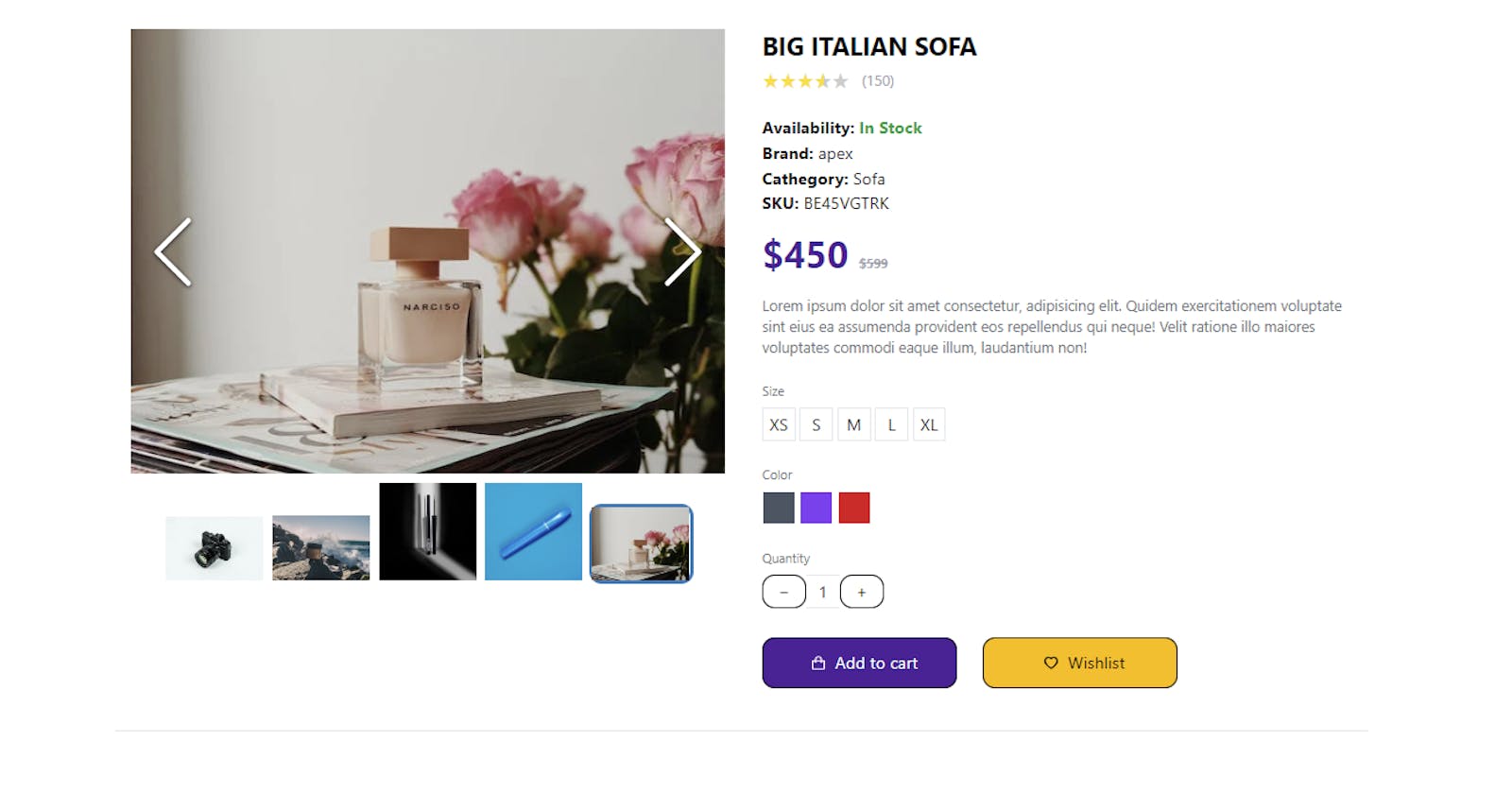
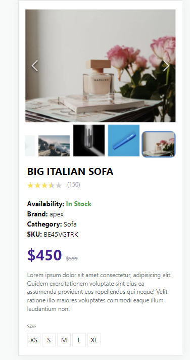
Before we dive into the code, let's take a moment to understand what we're going to build. Our product detail page will feature a product image gallery, product details (such as title, brand, availability, and price), a product description, size and color options, and buttons to add the product to the cart or wishlist.
Setting up the Environment
Before we start building our product detail page, make sure you have a React project set up with the necessary dependencies. If you haven't already, you can create a new React app using Create React App or your preferred method.
npx create-react-app product-detail-app
cd product-detail-app
npm install react-icons react-image-gallery react-rater
Creating the Product Detail Component
We'll create a component called ProductDetail.jsx, where most of our code will reside. This component will display the product details and use the React Image Gallery and React Rater components for the image gallery and product rating, respectively.
import { AiOutlineHeart } from "react-icons/ai";
import { BiShoppingBag } from "react-icons/bi";
import ReactImageGallery from "react-image-gallery";
import Rater from "react-rater";
import "react-rater/lib/react-rater.css";

const ProductDetail = () => {
  const productDetailItem = {
    images: [
      {
        original:
          "https://images.pexels.com/photos/90946/pexels-photo-90946.jpeg?auto=compress&cs=tinysrgb&w=600",
        thumbnail:
          "https://images.pexels.com/photos/90946/pexels-photo-90946.jpeg?auto=compress&cs=tinysrgb&w=600",
      },
      {
        original:
          "https://images.pexels.com/photos/1667088/pexels-photo-1667088.jpeg?auto=compress&cs=tinysrgb&w=600",
        thumbnail:
          "https://images.pexels.com/photos/1667088/pexels-photo-1667088.jpeg?auto=compress&cs=tinysrgb&w=600",
      },
      {
        original:
          "https://images.pexels.com/photos/2697787/pexels-photo-2697787.jpeg?auto=compress&cs=tinysrgb&w=600",
        thumbnail:
          "https://images.pexels.com/photos/2697787/pexels-photo-2697787.jpeg?auto=compress&cs=tinysrgb&w=600",
      },
      {
        original:
          "https://images.pexels.com/photos/3373736/pexels-photo-3373736.jpeg?auto=compress&cs=tinysrgb&w=1260&h=750&dpr=1",
        thumbnail:
          "https://images.pexels.com/photos/3373736/pexels-photo-3373736.jpeg?auto=compress&cs=tinysrgb&w=1260&h=750&dpr=1",
      },
      {
        original:
          "https://images.pexels.com/photos/3910071/pexels-photo-3910071.jpeg?auto=compress&cs=tinysrgb&w=600",
        thumbnail:
          "https://images.pexels.com/photos/3910071/pexels-photo-3910071.jpeg?auto=compress&cs=tinysrgb&w=600",
      },
    ],
    title: "BIG ITALIAN SOFA",
    reviews: "150",
    availability: true,
    brand: "apex",
    category: "Sofa",
    sku: "BE45VGTRK",
    price: 450,
    previousPrice: 599,
    description:
      "Lorem ipsum dolor sit amet consectetur, adipisicing elit. Quidem exercitationem voluptate sint eius ea assumenda provident eos repellendus qui neque! Velit ratione illo maiores voluptates commodi eaque illum, laudantium non!",
    size: ["XS", "S", "M", "L", "XL"],
    color: ["gray", "violet", "red"],
  };
  const plusMinuceButton =
    "flex h-8 w-8 cursor-pointer items-center justify-center border duration-100 hover:bg-neutral-100 focus:ring-2 focus:ring-gray-500 active:ring-2 active:ring-gray-500";
  return (
    <section className="container flex-grow mx-auto max-w-[1200px] border-b py-5 lg:grid lg:grid-cols-2 lg:py-10">
      {/* image gallery */}
      <div className="container mx-auto px-4">
        <ReactImageGallery
          showBullets={false}
          showFullscreenButton={false}
          showPlayButton={false}
          items={productDetailItem.images}
        />

        {/* /image gallery  */}
      </div>
      {/* description  */}

      <div className="mx-auto px-5 lg:px-5">
        <h2 className="pt-3 text-2xl font-bold lg:pt-0">
          {productDetailItem.title}
        </h2>
        <div className="mt-1">
          <div className="flex items-center">
            <Rater
              style={{ fontSize: "20px" }}
              total={5}
              interactive={false}
              rating={3.5}
            />

            <p className="ml-3 text-sm text-gray-400">
              ({productDetailItem.reviews})
            </p>
          </div>
        </div>
        <p className="mt-5 font-bold">
          Availability:{" "}
          {productDetailItem.availability ? (
            <span className="text-green-600">In Stock </span>
          ) : (
            <span className="text-red-600">Expired</span>
          )}
        </p>
        <p className="font-bold">
          Brand: <span className="font-normal">{productDetailItem.brand}</span>
        </p>
        <p className="font-bold">
          Cathegory:{" "}
          <span className="font-normal">{productDetailItem.category}</span>
        </p>
        <p className="font-bold">
          SKU: <span className="font-normal">{productDetailItem.sku}</span>
        </p>
        <p className="mt-4 text-4xl font-bold text-violet-900">
          ${productDetailItem.price}{" "}
          <span className="text-xs text-gray-400 line-through">
            ${productDetailItem.previousPrice}
          </span>
        </p>
        <p className="pt-5 text-sm leading-5 text-gray-500">
          {productDetailItem.description}
        </p>
        <div className="mt-6">
          <p className="pb-2 text-xs text-gray-500">Size</p>
          <div className="flex gap-1">
            {productDetailItem.size.map((x, index) => {
              return (
                <div
                  key={index}
                  className="flex h-8 w-8 cursor-pointer items-center justify-center border duration-100 hover:bg-neutral-100 focus:ring-2 focus:ring-gray-500 active:ring-2 active:ring-gray-500"
                >
                  {x}
                </div>
              );
            })}
          </div>
        </div>
        <div className="mt-6">
          <p className="pb-2 text-xs text-gray-500">Color</p>
          <div className="flex gap-1">
            {productDetailItem.color.map((x, index) => {
              return (
                <div
                  key={index}
                  className={`h-8 w-8 cursor-pointer border border-white bg-${x}-600 focus:ring-2 focus:ring-${x}-500 active:ring-2 active:ring-${x}-500`}
                />
              );
            })}
          </div>
        </div>
        <div className="mt-6">
          <p className="pb-2 text-xs text-gray-500">Quantity</p>
          <div className="flex">
            <button className={`${plusMinuceButton}`}>−</button>
            <div className="flex h-8 w-8 cursor-text items-center justify-center border-t border-b active:ring-gray-500">
              1
            </div>
            <button className={`${plusMinuceButton}`}> +</button>
          </div>
        </div>
        <div className="mt-7 flex flex-row items-center gap-6">
          <button className="flex h-12 w-1/3 items-center justify-center bg-violet-900 text-white duration-100 hover:bg-blue-800">
            <BiShoppingBag className="mx-2" />
            Add to cart
          </button>
          <button className="flex h-12 w-1/3 items-center justify-center bg-amber-400 duration-100 hover:bg-yellow-300">
            <AiOutlineHeart className="mx-2" />
            Wishlist
          </button>
        </div>
      </div>
    </section>
  );
};

export default ProductDetail;
Creating the App Component
Now that we have our ProductDetail component, let's integrate it into our App.js file:
import React from "react";
import ProductDetail from "./components/ProductDetail";

function App() {
  return (
    <div>
      <ProductDetail />
    </div>
  );
}

export default App;
Styling with Tailwind CSS
In your project, you're using Tailwind CSS for styling. Make sure you've set up your Tailwind CSS configuration and imported the necessary styles as shown in your index.css file. Tailwind CSS classes have been used in the ProductDetail component to style various elements.
in your global style index.css add this code
@import "~react-image-gallery/styles/css/image-gallery.css";

@tailwind base;
@tailwind components;
@tailwind utilities;
/* styles.css */
:root {
  --gold: #fde047;
}

/* Additional CSS rules for styling your React components */

@layer base {
  button {
    @apply border border-black rounded-xl px-5 py-1;
  }
}

.react-rater-star.is-active-half:before {
  color: var(--gold) !important;
}

.react-rater-star.is-active {
  color: var(--gold) !important;
}
Conclusion
In this article, we've started building a product detail page for your e-commerce website using React, React Icons, React Image Gallery, and React Rater. You can continue to expand and customize this component to fit the specific needs of your project. Building a great product detail page can significantly enhance the user experience and boost sales on your e-commerce site. Happy coding!