Introduction:
In this article, we will dive into the process of creating a responsive navbar component using React. A navbar is a crucial element of any web application, providing users with easy navigation and access to important features. We will explore how to design a dynamic navbar with a collapsible side menu and share button.
Creating the Navbar Component:
Let’s start by breaking down the code for our responsive navbar component, which consists of two main files: navbar.jsx and page.jsx.
navbar.jsx - This file defines the core functionality and layout of the responsive navbar. It utilizes React state, icons from various libraries, and CSS styling to achieve the desired look and behavior. The component includes a collapsible side menu and a share button.
"use client";
import React, { useEffect, useState } from "react";
import { AiOutlineHome } from "react-icons/ai";
import { GiHamburgerMenu } from "react-icons/gi";
import { BsShare } from "react-icons/bs";

const Navbar = () => {
  const [isOpen, setIsOpen] = useState(false);

  const sideList = [
    {
      icon: <AiOutlineHome className="text-2xl" />,
      title: "item 1",
    },
    {
      icon: <AiOutlineHome className="text-2xl" />,
      title: "item 2",
    },
    {
      icon: <AiOutlineHome className="text-2xl" />,
      title: "item 3",
    },
    {
      icon: <AiOutlineHome className="text-2xl" />,
      title: "item 4",
    },
  ];

  const navList = [
    {
      icon: <AiOutlineHome className="text-2xl mr-2" />,
      title: "item",
    },
    {
      icon: <AiOutlineHome className="text-2xl" />,
      title: "",
    },
    {
      icon: <AiOutlineHome className="text-2xl" />,
      title: "",
    },
  ];

  const handleDrawer = () => {
    setIsOpen(!isOpen);
  };

  useEffect(() => {
    const handleEscKeyPress = (e) => {
      if (e.keyCode === 27 && isOpen) {
        setIsOpen(false);
      }
    };

    if (isOpen) {
      document.body.style.setProperty("overflow", "hidden");
    } else {
      document.body.style.removeProperty("overflow");
    }

    document.addEventListener("keydown", handleEscKeyPress);

    return () => {
      document.removeEventListener("keydown", handleEscKeyPress);
    };
  }, [isOpen]);

  return (
    <nav className="flex  w-full items-center justify-between px-6 h-16 bg-white text-gray-700 border-b border-gray-200 z-10">
      <div className="flex items-center">
        <button className="mr-2" aria-label="Open Menu" onClick={handleDrawer}>
          <GiHamburgerMenu className="text-3xl" />
        </button>

        <img
          src="https://i.imgur.com/520zDfd.png"
          alt="Logo"
          className="h-auto w-24"
        />
      </div>

      <div className="flex items-center">
        <div className="hidden md:flex md:justify-between md:bg-transparent">
          {navList.map(({ icon, title }, index) => {
            return (
              <button
                key={index}
                title="Wishlist"
                className="flex items-center p-3 font-medium mr-2 text-center bg-gray-300 rounded hover:bg-gray-400 focus:outline-none focus:bg-gray-400"
              >
                <span>{icon}</span>
                <span>{title}</span>
              </button>
            );
          })}
        </div>
      </div>

      {isOpen && (
        <div className="z-10 fixed inset-0 transition-opacity">
          <div
            onClick={() => setIsOpen(false)}
            className="absolute inset-0 bg-black opacity-50"
            tabIndex="0"
          ></div>
        </div>
      )}

      <aside
        className={`transform top-0 left-0 w-64 bg-white fixed h-full overflow-auto ease-in-out transition-all duration-300 z-30 ${
          isOpen ? "translate-x-0" : "-translate-x-full"
        }`}
      >
        <span className="flex w-full items-center p-4 border-b">
          <img
            src="https://i.imgur.com/520zDfd.png"
            alt="Logo"
            className="h-auto w-32 mx-auto"
          />
        </span>
        {sideList.map(({ icon, title }, index) => {
          return (
            <span
              key={index}
              className="flex items-center p-4 hover:bg-pink-500 hover:text-white "
            >
              <span className="mr-2">{icon}</span> <span>{title}</span>
            </span>
          );
        })}
        <div className="fixed bottom-0 w-full">
          <button className="flex items-center p-4 text-white bg-blue-500 hover:bg-blue-600 w-full">
            <span className="mr-2">
              <BsShare className="text-2xl" />
            </span>

            <span>Share</span>
          </button>
        </div>
      </aside>
    </nav>
  );
};

export default Navbar;
page.jsx - This file simply imports and renders the Navbar component.
import Navbar from "@/Components/Navbar";
import React from "react";

const page = () => {
  return (
    <>
      <Navbar />
    </>
  );
};

export default page;
Exploring the Code:
The code for the responsive navbar component includes the following features:
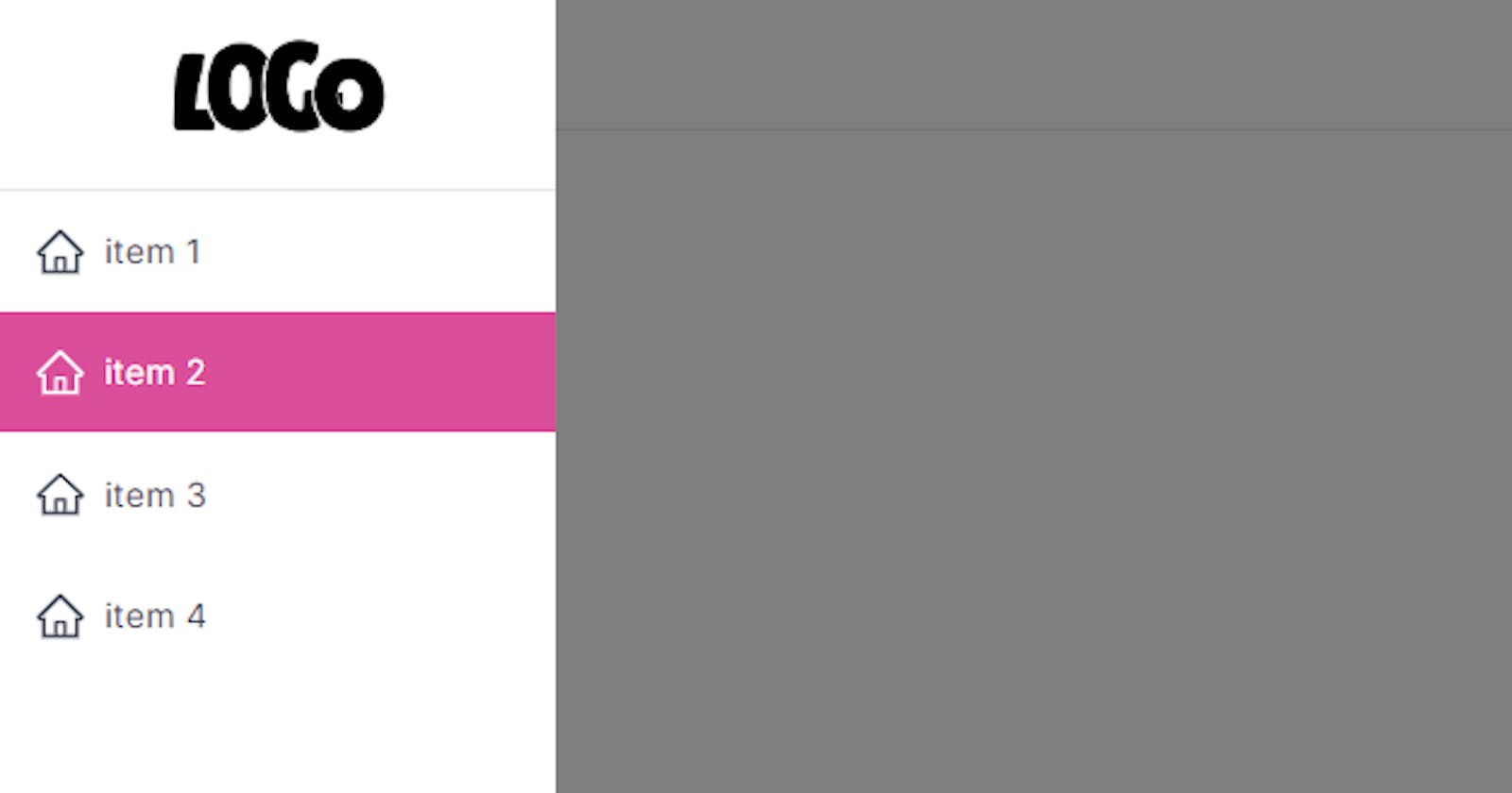
Collapsible Side Menu: The navbar incorporates a collapsible side menu triggered by a hamburger menu icon. When clicked, the side menu smoothly slides in from the left, offering additional navigation options.
Navigation Links: The main navbar includes navigation links that are visible on larger screens. These links are defined using the
navListarray.Responsive Design: The component is designed to adapt to various screen sizes. The side menu is hidden on smaller screens, and the hamburger icon appears for accessing the menu.
Share Button: At the bottom of the side menu, there’s a share button represented by the
BsShareicon. This button can be customized to implement sharing functionality.
Conclusion:
In this article, we’ve successfully created a responsive navbar component using React. By leveraging React state, useEffect, and CSS styling, we’ve built a dynamic navigation solution with a collapsible side menu and other essential features. This responsive navbar can be easily integrated into web applications to enhance user experience and provide seamless navigation.
Feel free to customize the component further and expand its functionality to match the requirements of your specific project. Happy coding!
