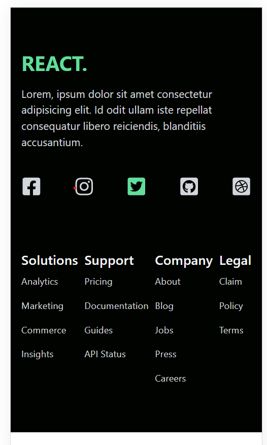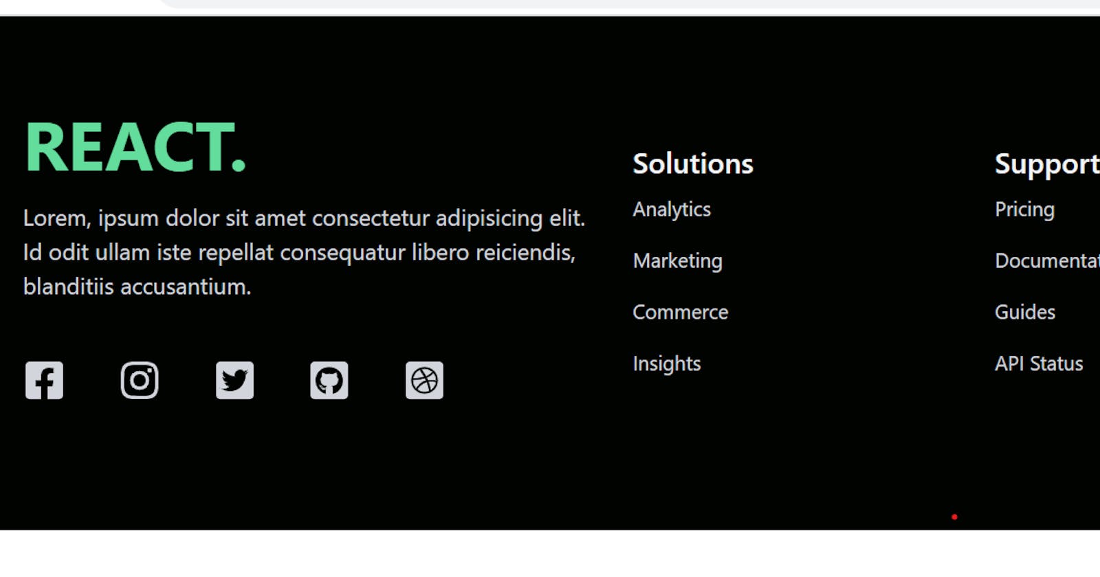
In web development, a well-designed footer can be the finishing touch that elevates the overall user experience of your website. Today, we’ll explore how to create a stylish and functional footer in React using reusable components.
Introduction
In this tutorial, we’ll be working with a React code snippet that demonstrates how to build a sleek footer component. This footer includes social media icons with a hover effect and neatly organized sections for different types of content.
// Importing necessary React and icon components
import React from 'react';
import {
  FaDribbbleSquare,
  FaFacebookSquare,
  FaGithubSquare,
  FaInstagram,
  FaTwitterSquare,
} from 'react-icons/fa';
// Reusable SocialIcon component with hover effect
const SocialIcon = ({ icon: Icon }) => (
  <Icon className="social-icon hover:text-[#00df9a]" size={30} />
);
// Footer component
const Footer = () => {
  // Array defining the content and structure of the footer
  const items = [
    // Social media icons
    { type: 'icon', icon: FaFacebookSquare },
    { type: 'icon', icon: FaInstagram },
    { type: 'icon', icon: FaTwitterSquare },
    { type: 'icon', icon: FaGithubSquare },
    { type: 'icon', icon: FaDribbbleSquare },
    // Footer sections
    { type: 'section', title: 'Solutions', items: ['Analytics', 'Marketing', 'Commerce', 'Insights'] },
    { type: 'section', title: 'Support', items: ['Pricing', 'Documentation', 'Guides', 'API Status'] },
    { type: 'section', title: 'Company', items: ['About', 'Blog', 'Jobs', 'Press', 'Careers'] },
    { type: 'section', title: 'Legal', items: ['Claim', 'Policy', 'Terms'] },
  ];
  // JSX structure of the footer
  return (
    <div className='bg-[#000300] mx-auto py-16 px-4 grid lg:grid-cols-3 gap-8 text-gray-300'>
      {/* Left section with brand and social icons */}
      <div>
        <h1 className='w-full text-3xl lg:text-4xl xl:text-5xl font-bold text-[#00df9a]'>REACT.</h1>
        <p className='py-4'>
          Lorem, ipsum dolor sit amet consectetur adipisicing elit. Id odit ullam iste repellat consequatur libero reiciendis, blanditiis accusantium.
        </p>
        <div className='flex justify-between md:w-[75%] my-6'>
          {/* Mapping over social icons and rendering the SocialIcon component */}
          {items.map((item, index) => (
            item.type === 'icon' ? (
              <SocialIcon key={index} icon={item.icon} />
            ) : null
          ))}
        </div>
      </div>
      {/* Right section with footer content organized in sections */}
      <div className='lg:col-span-2 flex justify-between mt-6'>
        {/* Mapping over sections and rendering content */}
        {items.map((item, index) => (
          item.type === 'section' ? (
            <div key={index}>
              <h6 className="font-medium text-gray-100 text-xl">{item.title}</h6>
              <ul>
                {/* Mapping over items in each section */}
                {item.items.map((subItem, subIndex) => (
                  <li key={subIndex} className='py-2 text-sm'>{subItem}</li>
                ))}
              </ul>
            </div>
          ) : null
        ))}
      </div>
    </div>
  );
};
export default Footer;
How to Use
To incorporate this footer into your React application, follow these simple steps:
- Install React Icons: Make sure to install the
react-iconspackage by running:
npm install react-icons
Copy the Code: Copy the provided
Footercomponent code and paste it into your React project.Integrate into App: Import the
Footercomponent into your mainApp.jsor any other relevant file:
import React from "react";
import Footer from "./components/Footer";

function App() {
  return (
    <div>
      <Footer />
    </div>
  );
}

export default App;
- Styling: Feel free to customize the styles and content of the footer to match your project’s design.
By following these steps, you can quickly enhance your React application with a stylish and functional footer.
Conclusion
Creating reusable components in React not only enhances code maintainability but also allows for the easy incorporation of sophisticated features. This tutorial demonstrated how to build a responsive and visually appealing footer using React components. Feel free to adapt and expand upon this code to suit the specific needs of your project. Happy coding!
