Introduction
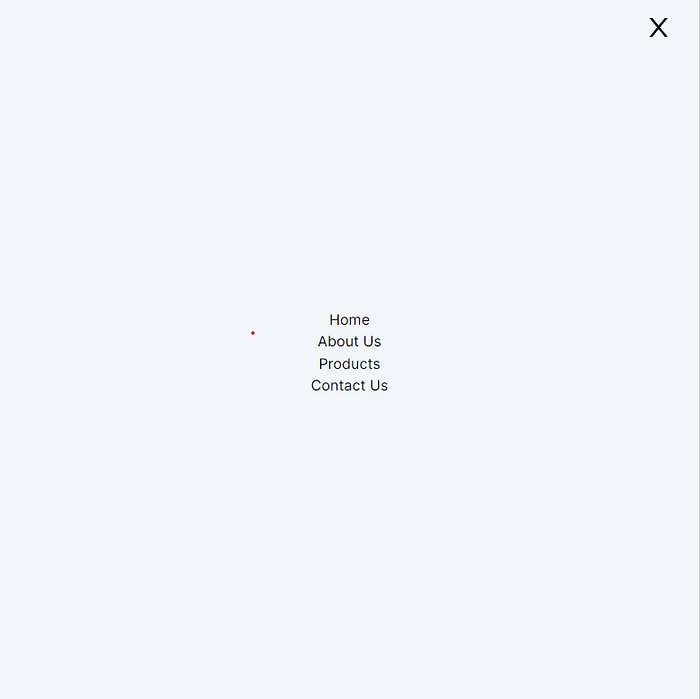
Navigation bars, or navbars, are an essential element of most web applications. They provide users with easy access to different sections of a website. In this article, we’ll walk through the process of creating a responsive navbar in a React application using the popular Tailwind CSS framework. We’ll also utilize some React icons to enhance the visual appeal of our navbar.
Prerequisites
Before we begin, make sure you have a basic understanding of React and Tailwind CSS. Additionally, ensure that you have the required dependencies installed in your project.
Setting Up the Project
To get started, create a new React application using your preferred setup. For this example, we’ll assume you have a project structure similar to the one shown below:
/src
  /components
    Navbar.js
  App.js
Creating the Navbar Component
Let’s start by creating the Navbar.js component in the /components directory. This component will contain our responsive navigation bar.
// Navbar.js
"use client"; // for nextjs 13.4 users
import React, { useState } from "react";
import { RxHamburgerMenu } from "react-icons/rx";
import { AiOutlineClose } from "react-icons/ai";
const Navbar = () => {
  const [isMenuOpen, setIsMenuOpen] = useState(false);  const navLinks = [
    { href: "#home", label: "Home" },
    { href: "#about-us", label: "About Us" },
    { href: "#products", label: "Products" },
    { href: "#contact-us", label: "Contact Us" },
  ];
  return (
    <>
      <header className="sm:px-8 px-4 py-2 z-10 w-full">
        <nav className="flex justify-between items-center max-container">
          <a href="/" className="text-3xl font-bold">
            Logo
          </a>
          <ul className="flex-1 flex justify-center items-center gap-16 max-lg:hidden">
            {navLinks.map((item) => (
              <li key={item.label}>
                <a
                  href={item.href}
                  className="font-montserrat leading-normal text-lg text-slate-gray"
                >
                  {item.label}
                </a>
              </li>
            ))}
          </ul>
          <div className="flex gap-2 text-lg leading-normal font-medium font-montserrat max-lg:hidden wide:mr-24">
            <a href="/">Sign in</a>
            <span>/</span>
            <a href="/">Explore now</a>
          </div>
          <div
            className="hidden max-lg:block cursor-pointer"
            onClick={() => {
              setIsMenuOpen(!isMenuOpen);
            }}
          >
            <RxHamburgerMenu className="text-4xl" />
          </div>
        </nav>
      </header>
      {isMenuOpen && (
        <div>
          <nav className="fixed top-0 right-0 left-0 bottom-0 lg:bottom-auto bg-slate-100  ">
            <div
              className="hidden max-lg:block fixed right-0  px-8 py-4 cursor-pointer"
              onClick={() => {
                setIsMenuOpen(!isMenuOpen);
              }}
            >
              <AiOutlineClose className="text-4xl" />
            </div>
            <ul className=" lg:hidden flex flex-col items-center justify-center h-full ">
              {navLinks.map((item) => (
                <li key={item.label}>
                  <a
                    href={item.href}
                    className="font-montserrat leading-normal text-lg text-slate-gray"
                  >
                    {item.label}
                  </a>
                </li>
              ))}
            </ul>
          </nav>
        </div>
      )}
    </>
  );
};export default Navbar;
Integrating the Navbar Component
Now that we’ve created our Navbar.js component, let's integrate it into our page.js file.
// Page.js
import React from "react";
import Navbar from "./components/Navbar";
export default function page() {
  return (
    <div>
      <Navbar />
      {/* ... */}
      {/* Your other components and content */}
      {/* ... */}
    </div>
  );
}
Conclusion
In this article, we explored the process of creating a responsive navbar in a React application using Tailwind CSS and React icons. We built a flexible navigation bar that adapts to different screen sizes and includes a mobile menu with toggle functionality. By following these steps, you can enhance the user experience of your web application by providing an intuitive and visually appealing navigation system.
Remember that this is just a basic example, and you can further customize and style the navbar to fit your project’s design and requirements. Happy coding!
