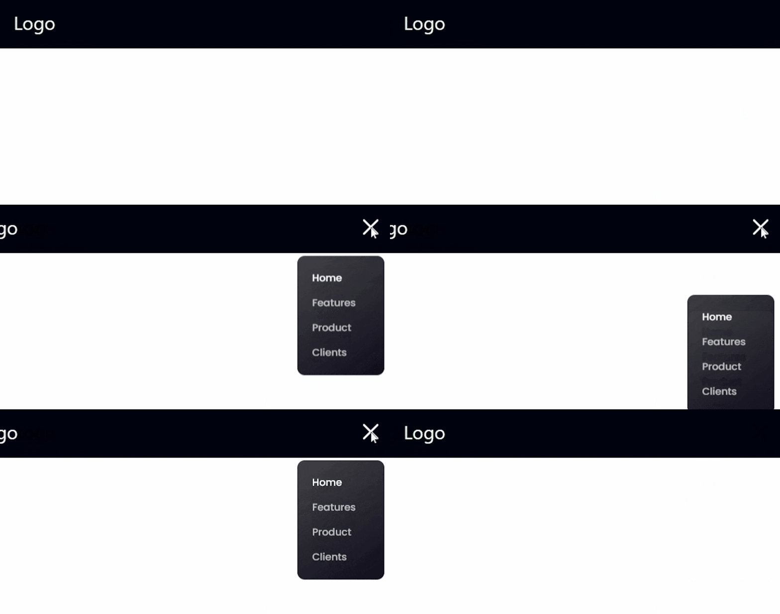
In this article, we will explore how to create a responsive navbar using React and Tailwind CSS. The code provided is a simple React application that includes a navbar component and some CSS styling using Tailwind CSS. We will break down the code, explain its components, and discuss how it all comes together to create a responsive and visually appealing navigation bar.
Introduction
The provided code consists of three main parts: the App component, the Navbar component, and the Tailwind CSS configuration. Let's start by understanding each of these parts and how they work together to create the final result.
The App Component
The App component is the entry point of our React application. It renders the main layout of the application, which includes a background color and a container for the Navbar component. Here's a breakdown of the code:
import { Navbar } from "./components";

const App = () => (
  <div className="bg-primary w-full overflow-hidden">
    <div className={`sm:px-16 px-6 flex justify-center items-center`}>
      <div className={`xl:max-w-[1280px] w-full`}>
        <Navbar />
      </div>
    </div>
  </div>
);

export default App;
We import the
Navbarcomponent from the "./components" directory.The
Appcomponent is a functional component that returns JSX.The outermost
divhas a class of "bg-primary," which sets the background color to a dark shade.The inner
divuses Tailwind CSS utility classes to control the padding and flexbox behavior.The
Navbarcomponent is rendered inside this layout.
The Navbar Component
The Navbar component is responsible for displaying the navigation bar at the top of the application. It includes a logo and a list of navigation links. Here's the code for the Navbar component:
import { useState } from "react";
import { close, logo, menu } from "../assets";

export const navLinks = [
  {
    id: "home",
    title: "Home",
  },
  {
    id: "features",
    title: "Features",
  },
  {
    id: "product",
    title: "Product",
  },
  {
    id: "clients",
    title: "Clients",
  },
];

const Navbar = () => {
  const [active, setActive] = useState("Home");
  const [toggle, setToggle] = useState(false);

  return (
    <nav className="w-full flex py-6 justify-between items-center navbar">
      {/* Logo */}
      <h1 className="text-3xl text-white">Logo</h1>

      {/* Desktop Navigation */}
      <ul className="list-none sm:flex hidden justify-end items-center flex-1">
        {navLinks.map((nav, index) => (
          <li
            key={nav.id}
            className={`font-poppins font-normal cursor-pointer text-[16px] ${
              active === nav.title ? "text-white" : "text-dimWhite"
            } ${index === navLinks.length - 1 ? "mr-0" : "mr-10"}`}
            onClick={() => setActive(nav.title)}
          >
            <a href={`#${nav.id}`}>{nav.title}</a>
          </li>
        ))}
      </ul>

      {/* Mobile Navigation */}
      <div className="sm:hidden flex flex-1 justify-end items-center">
        <img
          src={toggle ? close : menu}
          alt="menu"
          className="w-[28px] h-[28px] object-contain"
          onClick={() => setToggle(!toggle)}
        />

        {/* Sidebar */}
        <div
          className={`${
            !toggle ? "hidden" : "flex"
          } p-6 bg-black-gradient absolute top-20 right-0 mx-4 my-2 min-w-[140px] rounded-xl sidebar`}
        >
          <ul className="list-none flex justify-end items-start flex-1 flex-col">
            {navLinks.map((nav, index) => (
              <li
                key={nav.id}
                className={`font-poppins font-medium cursor-pointer text-[16px] ${
                  active === nav.title ? "text-white" : "text-dimWhite"
                } ${index === navLinks.length - 1 ? "mb-0" : "mb-4"}`}
                onClick={() => setActive(nav.title)}
              >
                <a href={`#${nav.id}`}>{nav.title}</a>
              </li>
            ))}
          </ul>
        </div>
      </div>
    </nav>
  );
};

export default Navbar;
We import the
useStatehook from React to manage the state of the navigation bar.We import
close,logo, andmenuicons from "../assets" to be used for the mobile navigation toggle.We define an array called
navLinks, which contains the navigation links and their titles.The
Navbarcomponent is a functional component that uses theuseStatehook to manage the active navigation link and the mobile navigation toggle state.The
navLinksarray is mapped to create navigation links with their respective titles.For the desktop view, the navigation links are displayed in a horizontal list (
ulwith class "sm:flex hidden").For the mobile view, the navigation links are displayed in a sidebar (
divwith class "sm:hidden").The
togglestate controls the visibility of the mobile sidebar when the menu icon is clicked.
Tailwind CSS Configuration
The final part of the provided code is the Tailwind CSS configuration. It defines the theme, colors, fonts, and breakpoints used in the application. Here's the code:
/** @type {import('tailwindcss').Config} */
module.exports = {
  content: ["./index.html", "./src/**/*.{js,jsx}"],
  mode: "jit",
  theme: {
    extend: {
      colors: {
        primary: "#00040f",
        secondary: "#00f6ff",
        dimWhite: "rgba(255, 255, 255, 0.7)",
        dimBlue: "rgba(9, 151, 124, 0.1)",
      },
      fontFamily: {
        poppins: ["Poppins", "sans-serif"],
      },
    },
    screens: {
      xs: "480px",
      ss: "620px",
      sm: "768px",
      md: "1060px",
      lg: "1200px",
      xl: "1700px",
    },
  },
  plugins: [],
};
We define the content to be processed by Tailwind CSS using the
contentarray. It includes HTML files and JavaScript/JSX files in the "src" directory.The
modeis set to "jit" for just-in-time mode, which improves the build performance of Tailwind CSS.The
themeobject is extended to include custom colors and fonts.The
colorsobject includes various color variables used throughout the application, such asprimary,secondary,dimWhite, anddimBlue.The
fontFamilyobject defines a font stack for the "Poppins" font, which can be used by adding the "font-poppins" class to elements.The
screensobject defines custom breakpoints for different screen sizes, allowing us to create a responsive design.
Conclusion
In this article, we explored a simple yet effective way to create a responsive navbar using React and Tailwind CSS. We broke down the code into three main parts: the App component, the Navbar component, and the Tailwind CSS configuration.
With this setup, you can easily customize the navigation links, add more pages to your application, and style the navbar to match your design requirements. By combining the power of React and Tailwind CSS, you can create stunning user interfaces that are easy to maintain and provide a great user experience.
I hope you found this article helpful in understanding how to create a responsive navbar with React and Tailwind CSS. Happy coding!
